
Sunday, October 12, 2014
This design by Andrio Abero is creative and likeable. I'm not sure why the designer chose a theme with bumble bees but that is probably because I am unfamiliar with the bands mentioned here. There isn't a whole lot of info to work with so space has been filled in an amusing sort of way. The bees are all very large and don't look like they are capable of flying, but are still somehow suspended. The text has been boxed in but this is one of the rare instances where this sort of thing actually works. If it were possible it might be better if the lines that box in the text were farther away from the text. The text would also stand out more if it were black instead of white. Despite these little things, it is a good design.
This poster designed by Jessalyn Aaland is a crime against typography. The designer chose to use a collage effect by piecing together different pictures from what appears to be the 1950's. To top it all off, the pictures and the text have been placed on a horrendous, yellow background, Worst of all is the arrangement of text! The white text on the yellow background is hardly legible and it is all over the place making it even harder to read. even if the text was black it wouldn't help this design to be any better. There is also text in the triangles at the top of the page bit it looks broken and disconcerting because of all the colors and spaces between the letters. The illustration at the bottom of the page is just to busy and is looks like the people are floating on the bright yellow background. Unfortunately the same designer has created other monstrosities such as this. Perhaps this poster and others like it were the result of client work, and perhaps this is what the client wanted. I don't know what client would want this, but people never cease to amaze me.

This poster designed by James A. Holland reminds me of something out of the 60's, and I am trying to decide whether I like it or not. The only reason it give off a 60's vibe is because of all the pink flowers that are all over the place. Other than that it seems almost like 80's/90's punk rock. Despite everything being pink the illustration is actually pretty good. The large font that was used for the name of the headliner is okay, but the small font that is above it looks like it is being smashed against the top of the poster. Furthermore, the font is so small that I can barely read it. It looks like the designer used three different fonts, which is fine. I don't like the arrangement of the font at the very bottom of the page. From far away it looks like a hamburger, and it looks like it is being consumed by all of the pink flowers. The illustration takes up to much space leaving little room for the text. It might also help if there was some color variation.

I like the concept that the designer Remi A. has put together here. The idea of making a gig poster look like a playing card is both creative and innovative. The illustration is also very good, and flipping it upside down makes the poster interesting to look at. Even the edges of the poster look worn, like those of a playing card. While the illustration is good the typography of the poster is somewhat wanting. In this instance you can get away with putting text in a box, because the box makes the poster look more like a playing card. However, if you are going to use a box you shouldn't cram your text right up to the edges, and that is exactly what the designer did here. While I think the text is pretty I'm not a huge fan of it. I can see why the designer used it though, and the poster is for a church function so it seems to serve its purpose well. The poster could also be improved by arranging the text differently. The way it is set up now it looks jagged as it moves from one side of the page to the other. It also seems as though the text in the middle of the page is being sandwiched between the illustration and the bold print of the headliner. While the design needs some work, I am still very fond of the concept.

This gig poster designed by Shaun A is aesthetically pleasing and the location of the text makes the composition even better. The designer obviously wasn't given a whole lot of text to work with but they still made it work. It is great that the headliner is so big but there is additional information above it. this adds quite a bit of interest plus it helps pull the composition together. The smaller text in the right hand corner also looks good, and it fills a space that would definitely need something if it were empty. The variation of the greens also creates a nice effect and almost gives the text a pattern. There are some little things wrong with the text at the top of the page though. The words "Fresh" and "Onlys" should be lined up, but "Onlys" is moved slightly to the right. There is also to much space between the L and the Y in "Onlys", but this would be an easy fix. I like how the information at the top of the page has been put at an angle instead of being perfectly centered. The text at the bottom of the page also stands out really well and The different shades of brown text for the location and date add some interest. The illustration is also really good, and the choice of color is wonderful.

Wednesday, October 8, 2014
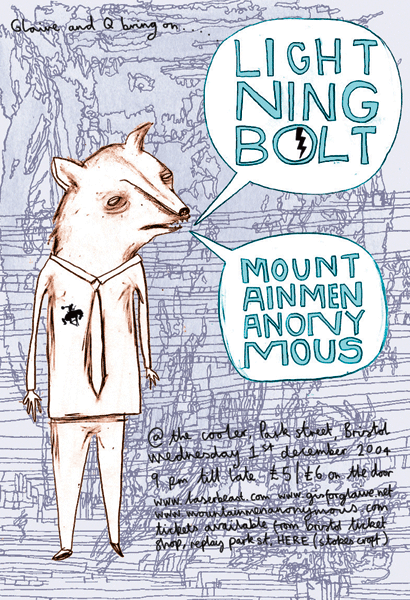
I don't like this poster, designed by Benjamin Power. The colors are okay, but the composition just isn't good. The headliners are trapped inside text bubbles and the fact that the designer added a stroke just makes the text seem even more cramped. The text looks like it was hand drawn and the spacing between some of the letters isn't even, making the titles feel slightly broken. I also dislike how the syllables in the headliner band names have been separated, making it hard to read them. I haven't heard of these bands before so I am going to assume there is a reason for such a peculiar illustration. The animal pictured here looks sickly, almost like it is dying, and there is something very disturbing about it. Because of all the scribbles, the background looks very messy and it makes the smaller text at the bottom of the page hard to read. The smaller text isn't spaced properly either. If the background was just a solid purple and the names of the headliners weren't broken it would improve this poster quite a bit, but it would still need work.
Wednesday, October 1, 2014
I'm not very fond of this design. There is a unfortunate lack of text, and the design isn't all that great either. The constant repetition of the bottles and skulls is far to monotonous and takes away from the general information and the name of the band. I like how the colors work together to create a mad scientist vibe. It might look better if the black and the white were flipped so that the background is black and the skulls are white. The text for the headliner looks fine but there seems to be a stray skull and crossbones underneath the "e". I think it is intentional, but it just ends up looking like a mistake.
I don't like how the text is trapped in a sea of skulls and bottles, and the general information is barely visible down in the lower right hand corner, and seems to be shrinking back. The font has very little room to breathe. Despite this posters horrible design, there are so many ways to make it look awesome. Instead of using so many skulls and bottles, you could take one of each and enlarge them to fit the page or bleed off the page. This would allow breathing room for the text. With some work this poster could be pretty good.

I don't like how the text is trapped in a sea of skulls and bottles, and the general information is barely visible down in the lower right hand corner, and seems to be shrinking back. The font has very little room to breathe. Despite this posters horrible design, there are so many ways to make it look awesome. Instead of using so many skulls and bottles, you could take one of each and enlarge them to fit the page or bleed off the page. This would allow breathing room for the text. With some work this poster could be pretty good.
Subscribe to:
Posts (Atom)