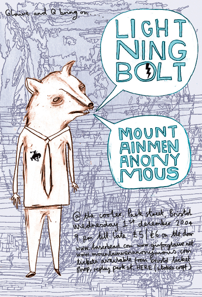
I don't like this poster, designed by Benjamin Power. The colors are okay, but the composition just isn't good. The headliners are trapped inside text bubbles and the fact that the designer added a stroke just makes the text seem even more cramped. The text looks like it was hand drawn and the spacing between some of the letters isn't even, making the titles feel slightly broken. I also dislike how the syllables in the headliner band names have been separated, making it hard to read them. I haven't heard of these bands before so I am going to assume there is a reason for such a peculiar illustration. The animal pictured here looks sickly, almost like it is dying, and there is something very disturbing about it. Because of all the scribbles, the background looks very messy and it makes the smaller text at the bottom of the page hard to read. The smaller text isn't spaced properly either. If the background was just a solid purple and the names of the headliners weren't broken it would improve this poster quite a bit, but it would still need work.

No comments:
Post a Comment