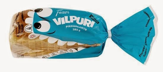
Of all the designs I have seen for a bread bag this is be most creative I have seen so far. I can't really tell what the bag says, and I'm not sure if it is an actual brand or if the designer used Lorem Ipsum. The font has plenty of breathing room, but I think the design could be improved if the font that is on the clear plastic was moved into the empty space on the fish. I like that some of the font was put on the fishes teeth. While these spaces are small, it is still a creative way to incorporate font into the design. The font itself is okay and the designer stuck with the "rule of three" and only used a minimum amount of fonts. I love the concept but a lot more could be done with it typographically.

No comments:
Post a Comment