Monday, December 1, 2014
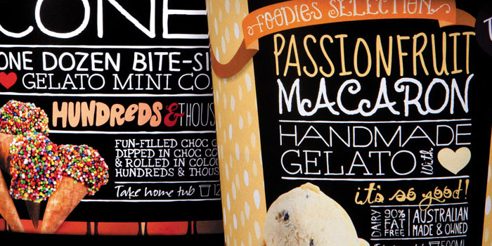
I love ice cream but this design is somewhat overwhelming. Once again I have found a designer who used more than three fonts in there design. The designer also seems to be afraid of empty space as there is either a picture or font filling every space on these ice cream containers. The font is also stacked and combined with dividing lines, and this creates a sandwich effect. I do like the colors, and the fonts are fun and inviting which is perfect for an ice cream container. The smallest text is at the bottom of the page, and while this is usually a terrible place to put it because it gets squished by the larger text, it actually looks okay because the picture of the ice cream holds the larger text up. The designs are colorful and friendly but it would be okay to have some empty space. Removing one of the fonts and changing the font size would also be a good way to make things less busy. I like the concept but the font needs breathing room because it is all crammed together. With a little work this design could be even better.


Subscribe to:
Post Comments (Atom)
No comments:
Post a Comment