The 100 Grand chocolate bar wrapper is one that I really wish I could redesign. While the chocolate bar itself tastes good the wrapper looks like it was designed in a hurry. To start off, all the font is inside a box. It looks like the designer used three different fonts, the first being a large serif font, and I'm not sure if it is custom or not. The smaller font bellow the "100 Grand" looks like it might be Times New Roman which is probably the most commonly used fonts ever. The font in the right hand corner is an italicized san serif and it kind of throws of continuity but it still manages to add a little interest to this dull design. Not only is the product name inside a box, but the font itself has a stroke around it making the font even more contained. Candy bar wrappers are supposed to be fun, interesting and iconic. This wrapper could be redesigned using similar colors and fonts, but it would help the design to be so much better if everything wasn't boxed in.
Wednesday, December 3, 2014
Pringles has a new look, and its cheesy!!!! I love that the designer of this ad created the text out of cheese. It is done in a simple san serif font which works well, and the illustration is so life like. Besides the giant wall of cheese in the notable Pringles container at the bottom of the page. Everything on the Pringles container is arranged in the usual Pringles fashion. Luckily the font has plenty of breathing room and the designer only used three fonts in the design. I like the Pringles design but I think if they use new ingredients it might also be beneficial to arrange the text differently than usual. I love the realistic graphics for the ad and the bright orange and yellows of the design, and the designers incorporation of the colors onto the container.
The design and typography for these bags of seed are wonderful. This is the first design I have seen in a while where the designer didn't use center alignment, and actually put the larger font on the bottom. This isn't the case with the pink bag, but the arrangement is still good. However, I don't like the font and the product could be so much better if there was font variation. For the whole thing the designer used a simple san serif font, and while there is color and size variation, the font just isn't interesting. I like the illustration and that we can see the product through the illustration, but a boring font was used in a less than interesting way, so the design is lacking in that area.
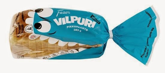
Of all the designs I have seen for a bread bag this is be most creative I have seen so far. I can't really tell what the bag says, and I'm not sure if it is an actual brand or if the designer used Lorem Ipsum. The font has plenty of breathing room, but I think the design could be improved if the font that is on the clear plastic was moved into the empty space on the fish. I like that some of the font was put on the fishes teeth. While these spaces are small, it is still a creative way to incorporate font into the design. The font itself is okay and the designer stuck with the "rule of three" and only used a minimum amount of fonts. I love the concept but a lot more could be done with it typographically.
I love the illustrations on these potato chip bags but the thought that was put into the arraignment of font is somewhat lacking. As usual the designer decided to use center alignment, which is less than interesting. I do like that the font is somewhat three dimensional, and it gives the allusion that it is floating. Despite the center alignment the font's color and sizes are very well done. The bag could use more detail and a different font might make the design better. I like that the illustrations look like paper cutouts, and that the chips were incorporated into the design. There is a lot of empty space and the font has plenty of room which is good. The colors are vibrant and would stand out on a store shelf.
This is one of those packages where the designer decided to put all the font inside a box. The design could be so much nicer to look at if the font wasn't contained. The designer used a simple font and it looks fine, but using more then one font might make the design a bit more interesting. I keep finding these designs where all the font is center aligned, and it is so frustrating because it is so generic. As usual the designer chose to put the largest font on top, this of course crushes the smaller fonts below it. Yes the designer used dividing lines, but this only creates a sandwich effect. Moving the text out of the box and using some font variation would help this package design so much. I do love the photograph, because it is noticeable and it looks delicious. The font on the side of the box looks pretty good, except that it has a jagged edge and adjusting the tracking could definitely help this problem. I do love the colors that were used for this package, and with a little work this design could be so much better.
Product design can be hard, especially when you are trying to target a certain audience. If this product is targeted towards an audience that is willing to spend money then the designer did a good job. When I look at this I get the feeling that the product is healthy, and it looks like something that would be found in a health food store. I like that the design is somewhat old fashioned and I like the font that is at the top of the page. However, the font at the bottom of the page seems very generic. It looks like the designer used Times New Roman, and that paired with a completely different San Serif font doesn't really work well together. The text does have plenty of room which is great, but it is center aligned which makes the design even more generic. The color combinations were done very well the continuity of the text is lacking. The design would be a lot better if some of the font was changed, and maybe even moving the illustrations around could add interest.

There are a lot of good ideas in this gig poster, but there are some things that need to be improved. I keep finding designs where the text just wasn't given any breathing room, and this design is another example of font without room. The font is okay and it goes well with the illustration, and the designer did a good job of using continuity in his/her design. I love the illustration, and I like the use of color. I like the idea of using dividing lines to separate the font from the illustration. unfortunately the font was crammed inside the dividing lines and this creates a box effect where the text feels like it is being crushed between to heavy objects. The illustration would be so much better if someone moved the dividing lines further apart and gave the font some room. Another thing that might help the design is moving some of the text so that it isn't center aligned. Doing this could add interest to the design and make the font arrangement less generic.
The design and typography that were used for this bottle wrapper was done very well. While there are a couple things that do need fixing I will start by writing about the good aspects of the design. The amount of branding on this has been pushed to the limit, but somehow i works. I love the illustration of the kraken because it looks like it was hand drawn instead of cheaply, and quickly done. The design seems to be directed towards clients who have plenty of money to spend. The text is inside a box, but in this case it works very well. The text inside the box is center aligned but it would probably look strange if it wasn't. The biggest problem with the design is that the small text at the top and bottom of the label have been pushed so close to the top and bottom of the page. Looking at these two small bits of text I automatically want to move them so that they won't be shoved up against the edges of the page, and I also wouldn't make them center aligned. This aspect of the design could be improved through adjusting the tracking and maybe even the leading. Despite this there are many wonderful things about this design.

I got a pretty good laugh out of this poster, simply because it is so brutally honest. I don't like the font that much, but it is more personal preference than anything. While the designer did only use two different fonts he/she did use different variations of the bold san serif font. The designer used dividing lines to improve the design by making it more interesting. The dividing lines also prevent The large text at the top of the page, from squishing the smaller text at the bottom of the page. The use of color is pleasant to look at, and it helps to emphasize certain words on the page. because of the font and the way it is arranged it reminds me of a World War two poster. An overall good use of space and the text isn't cramped which is very good.
I love the Bible verse on this poster, but I am not a fan of the typography that was used to put it together. There is a ton of space that could have been used to give the font breathing room but for some reason the designer decided to cram it into the center of the page. And even stranger is the fact that the designer used an excess of dividing lines and illustrations to turn the text into a box shape. I also dislike how each word seems to be separate, even though all the words make up a sentence. It makes the design seem broken. I do like that the designer used the same font for the whole design but still got creative with it. I'm not a huge fan of the colors. I like the blue and white paired with the black, but the background color just doesn't work well. To improve the design, playing around with the tracking and leading might help, giving the text breathing room by spreading it out more and getting rid of some of the illustrations that cause the text to be contained, would help a lot.
Another good example of using text to create an illustration, this poster is both creative and fun. The first thing you recognize is the shape, and since Darth Vader is such an iconic figure this works very well. The small font is at the top and it gets heavier as you move towards the bottom of the illustration. This is also good because one of the first things that the viewer notices are the words "The dark side" which makes the illustration stand out even more, especially for those who get the reference. It is a design that looks like it was done in illustrator, but I am not entirely sure because there is a slight watermark in the background and we can see Darth Vader's face, cape, and other features. Another aspect of the design that makes it great is the red light-saber which stands out and catches our eye. This is an awesome design both typographically and esthetically, and most Star-wars fans would be happy to hang it on there wall.

Tuesday, December 2, 2014
This design isn't my favorite, but there are some good things about it. This is a good example of using text to represent an object or to create an illustration. It is simple yet eye catching, and it was innovative of the designer to make the front of the box red on white, and the side of the box white on red. This is another instance where the smaller font was placed at the bottom of the design, and while it isn't always a good idea to put smaller fonts at the bottom because they tend to get weighed down by larger fonts on top, the design actually works. This is because the slice of pizza which is represented here is at an angle. Granted, all the text looks like it will fall over on its side because of the angle it is sitting at. This adds a little bit of playfulness to the design. I think what bothers me most is all the empty space. I like empty space, but in this case there seems to be to much, and it might be good to add some other elements to the box such as vector illustrations of peppers and olives. I love the idea and I love how the text was used to create the shape of a slice of pizza.

I really like this design because it is whimsical and the use of font is very good. The font that is used for the main product looks like it is floating above the smaller font, and even though it is the darkest and heaviest font on the jar it doesn't really look like it is about to squash the small font. The font that was chosen for the product name is perfect, because it looks like the product. Another great thing about the design is that the text has plenty of breathing room and isn't boxed in. The text on the sides of the jar is also pretty good and the incorporation of dividing lines was used really well so that everything is fairly even. Center justification usually doesn't work, but in this case it works well. The illustrations are also very fun and inviting, and the colors would help the jar stand out on a shelf.

Monday, December 1, 2014
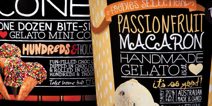
I love ice cream but this design is somewhat overwhelming. Once again I have found a designer who used more than three fonts in there design. The designer also seems to be afraid of empty space as there is either a picture or font filling every space on these ice cream containers. The font is also stacked and combined with dividing lines, and this creates a sandwich effect. I do like the colors, and the fonts are fun and inviting which is perfect for an ice cream container. The smallest text is at the bottom of the page, and while this is usually a terrible place to put it because it gets squished by the larger text, it actually looks okay because the picture of the ice cream holds the larger text up. The designs are colorful and friendly but it would be okay to have some empty space. Removing one of the fonts and changing the font size would also be a good way to make things less busy. I like the concept but the font needs breathing room because it is all crammed together. With a little work this design could be even better.


I'm not a huge fan of the design of this bottle but it does have some redeeming qualities. The designer used the shape of the bottle to create dividers for the text which adds a nice touch. The text is also perfectly lined up and there aren't any weird spaces between the words. The illustrations are nice and they make the design look old fashioned which makes the design kind of welcoming. Unfortunately there is a lot going on which makes the design less than inviting. There is a lot of text and it has all been piled up in a giant sandwich complete with dividing lines to separate the sentences. This makes things broken in some places and hard to keep track of. There are also to many texts used here and it makes the design even busier. I can see that the designer was trying to make things interesting but in the process he or she seems to have made things a little to overwhelming. While gutters were used to create space between text, the text still doesn't have breathing room. This is probably because of the bars that create a box effect. It isn't a terrible design but it could use some work so that it wouldn't be so cramped.

Subscribe to:
Comments (Atom)


